|
1. Help! My Online Picture Colors Don't Look Accurate! |
|
Monitor Calibration is very important for accurate online picture viewing for all photographers and their customers. For many people, viewing pictures on a monitor can be a very frustrating experience. Usually, this is because your monitor is not calibrated properly. What looks good on one monitor can look too dark or too bright on another. Believe it or not, the same is true that what looks good with one browser may look slightly different on another! While this is not a perfect calibration system, it does provide photographers and their customers with some good feedback on their ability to view online pictures as they were meant to be seen.
As a wedding photographer, accurate color calibration is critical. Below are some test bars which will help you to more closely match an accurate monitor setting. In most cases, monitor settings are too bright to accurately view images! As shown, the pictures on this website will print accurately with true color recreation. If your monitor is too light or too dark and you adjust your own pictures with that innacurate setting, your pictures will not print as you see them! Therefore, monitor calibration is a critical step to accurate picture viewing and printing. Often I use a monitor calibration tool such as those made by Eye One monitor calibration tools There are other monitor calibration devices, it's just the one I happen to use.
If This Information Helps You, Help Others - Click Here for HTML Code To Link To This Page! |
2. Easy Monitor Calibration Tests for Online Picture Viewing |
If you can't read the numbers embedded within the color strips below, your monitor is set too dark or too bright. Ambient light levels and reflections on your monitor can also have a significant effect on your ability to view pictures accurately. You may not be able to adjust your monitor to pass all the tests below. I've found it best to check monitor brightness and contrast levels in the evening without any direct light falling on my monitor. Often, the best results can be obtained by setting your monitor contrast to 100% and the brightness level to approximately 25%. |
Click on Bar to View on a black background
(opens new window) |
 |
|
|
Click on the black bar above to view it in a separate window. Seeing it on a black background makes it much easier to view accurately. Closing your eyes first for a few seconds may also improve visibility of the lowest numbers depending on your ambient light.
The black bar above shows how well your monitor copes with the dark end of the tonal range. On a well-adjusted monitor and in a program like Photoshop that uses a Calibrated Monitor Profile you should be able to see all the numbers embedded above from 10 down to the number 1 in normal ambient lighting conditions. If you are viewing the above black bar in a browser, you may only be able to see the number 2 - look very closely! I'm obtaining more feedback on how different browsers display the above chart, I'm not convinced that they make a substantial difference in visibility - as I can see the number 1 in Internet Explorer.
Suffice to say, however, that if you can see the number 2 while viewing this page in a browser, then you will be able to view pictures fairly accurately assuming the author created them using a properly calibrated monitor. If your monitor is too dark, has too much contrast, or there is too much ambient light, you won't see the low numbers. Of the four different tests, most monitor settings "fail" this one. |
|
The grey panel above is 50% grey, half way in tone between black and white. You should be able to see all the numbers from -5 to 5 easily - except the zero in the middle. For reference, I can see all numbers except zero.
If This Information Helps You, Help Others - Click Here for HTML Code To Link To This Page! |
|
The white bar above shows your monitor's ability to handle highlight tones. Under normal conditions, you should be able to see all the numbers in the white bar above from 10 down to 1. If your monitor is too bright or has too much contrast, the lower numbers will disappear into the white background. For reference, I can see all numbers with the 1 being very faint - you should see the same! |
|
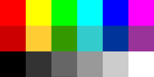
Lastly, use the above chart to accurately set your monitor's color scheme. If your monitor color is reasonably accurate, the colors across the top should be RED, YELLOW, GREEN, CYAN, BLUE, and MAGENTA. If they aren't, the color on your monitor is significantly off. The second row has more muted versions of the same colors. The bottom row is a six step grayscale from black to white.
There should be no color tint in the bottom row. You can probably set a range of color temperature settings on your monitor from 5500K to 6500K to 9300K. Most RGB monitors look best if they are set around 6500K.You can also compare what you see on your monitor to known colors in any picture. In other words, if the grass is not green or the barn is not red, your monitor is inaccurately set or is not capable of rendering colors properly!
One last tip: when you print your pictures and the colors look substantially inaccurate, there's a good chance you didn't convert the color space from Adobe RGB to sRGB! This is also true if you upload your pictures to the web and the colors look dull!
If this Information Helps You, Cut and Paste the Following Code
Into Your HTML to Link to this Page!
Disclaimer: This information is provided free of charge and is based on my own experience and feedback from other photographers. However, in using this information, you agree that John Fitzpatrick and/or MomentsKept Studios are not liable for any undesirable outcomes you may experience from relying upon it. Use this page at your own risk but know that it was created with good intent! |
|